Seattle Art MuseuM INTERNSHIP
During my internship, I worked on concurrent projects focused on idea and concept generation, preparation of design visuals, working with existing files to make revisions, and generally helping the designers to design, present, and prepare projects. Projects include print materials, digital design, in-gallery graphics, signage, and other hands-on activities. Here are some examples of my work.
Designing the in-gallery graphic for Aaron Fowler's solo exhibition was an exciting project that allowed for creative freedom. First, I researched Fowler's previous work and then explored various title treatments. Choosing a typeface and color for the vinyl sheet that would complement the artwork at the SAM posed some challenges, as the artwork was not known until installation. Fortunately, both the curator and the artist loved it.
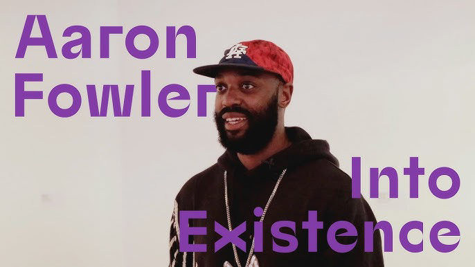
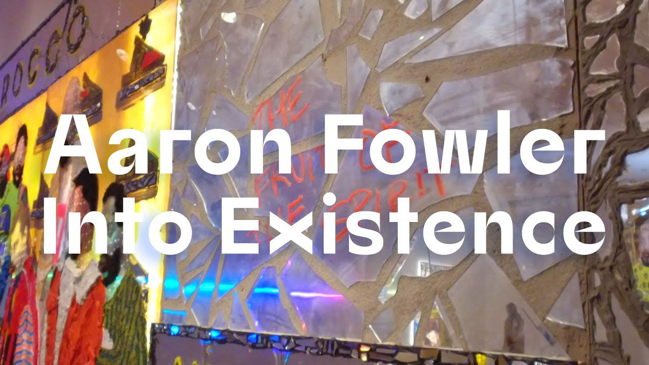
The "lock up" I created was also used in two video promotions of the exhibition.
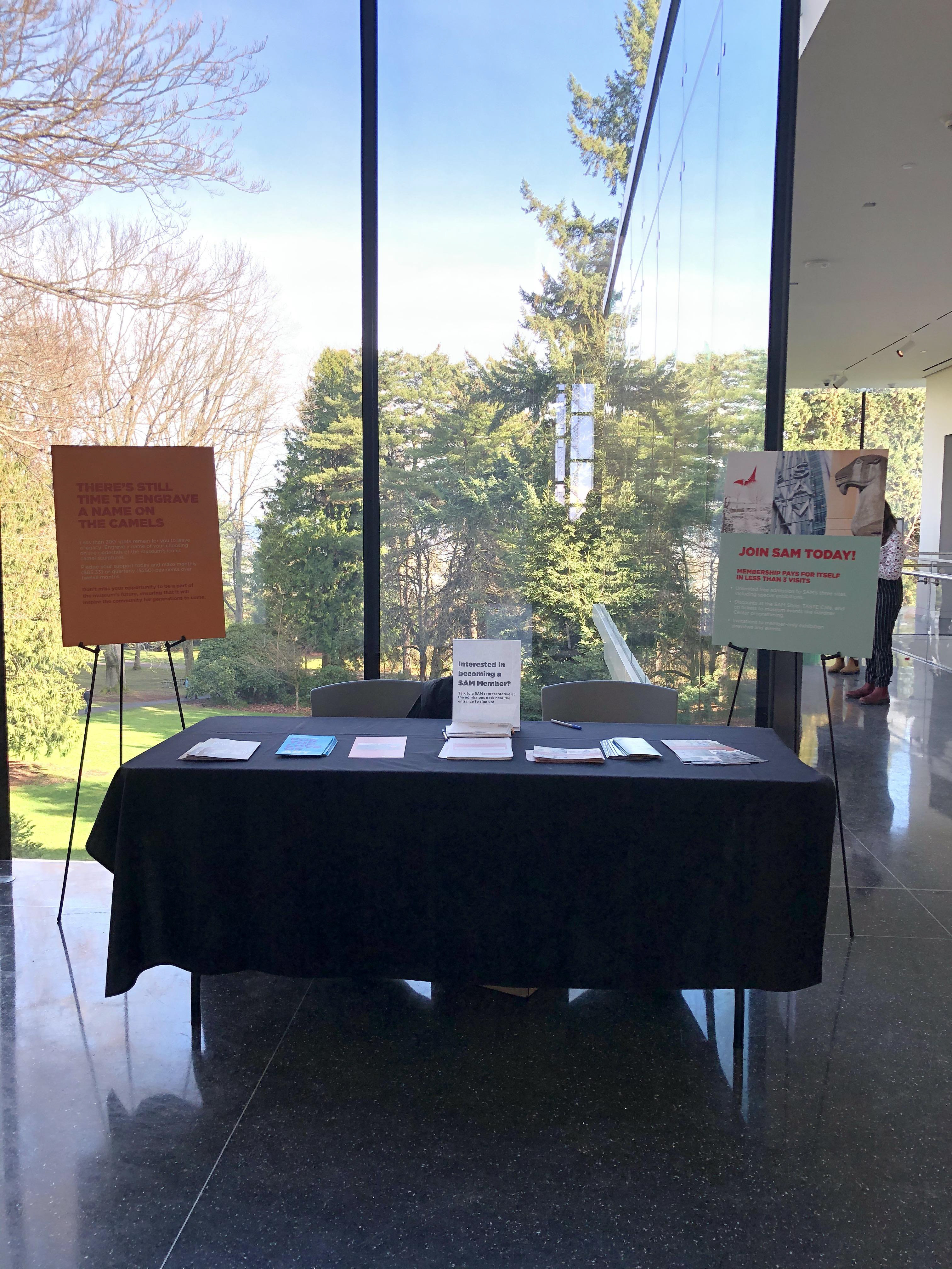
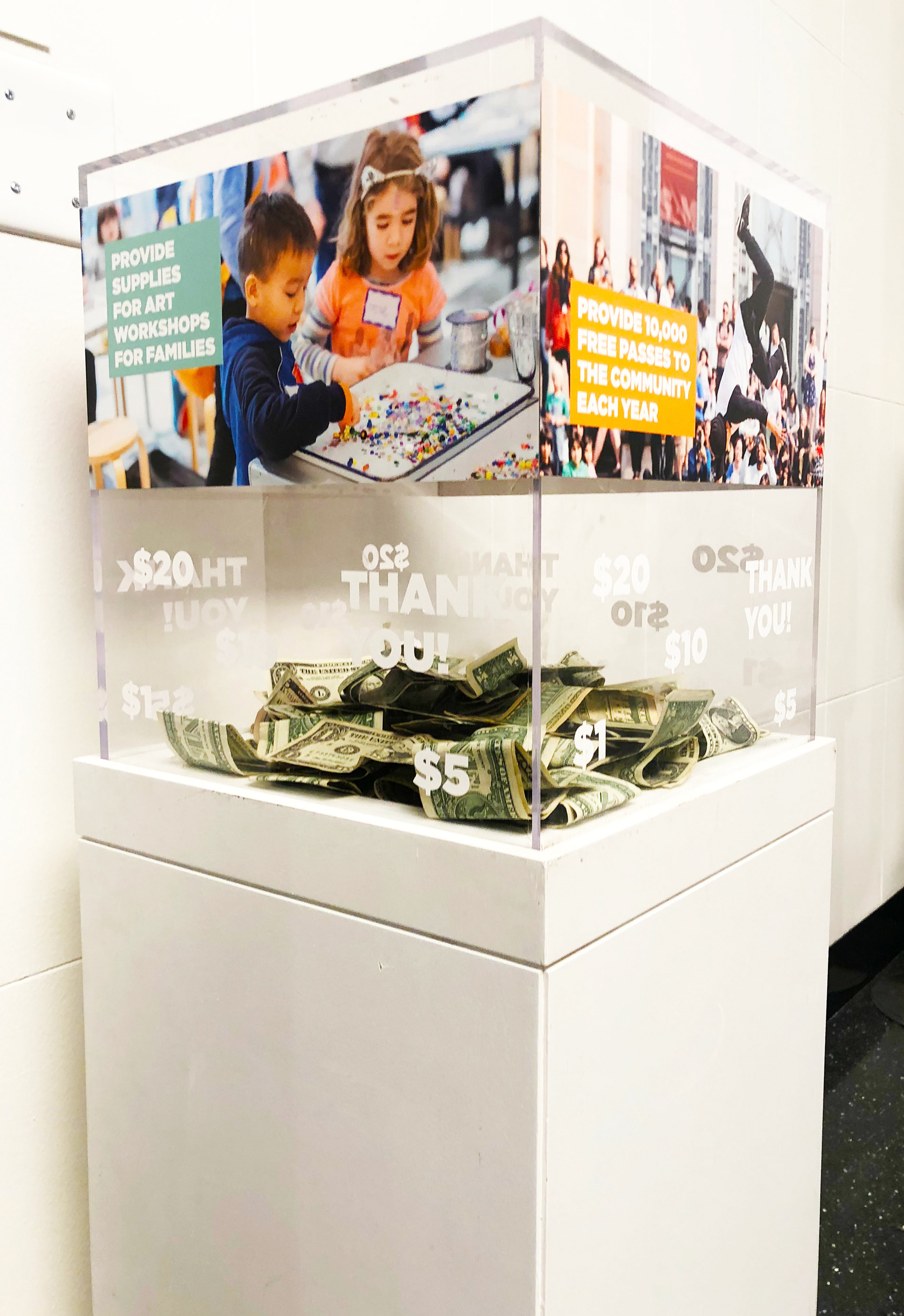
The Asian Art Museum reopening campaign was another significant project that I was involved in, specifically promoting the Housewarming opening weekend. I designed digital ads (static and animated gifs in seven sizes), posters, and a graphic for the donation box.
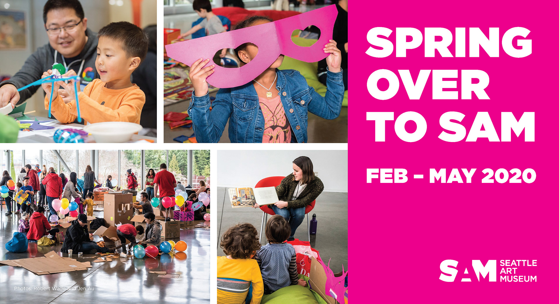
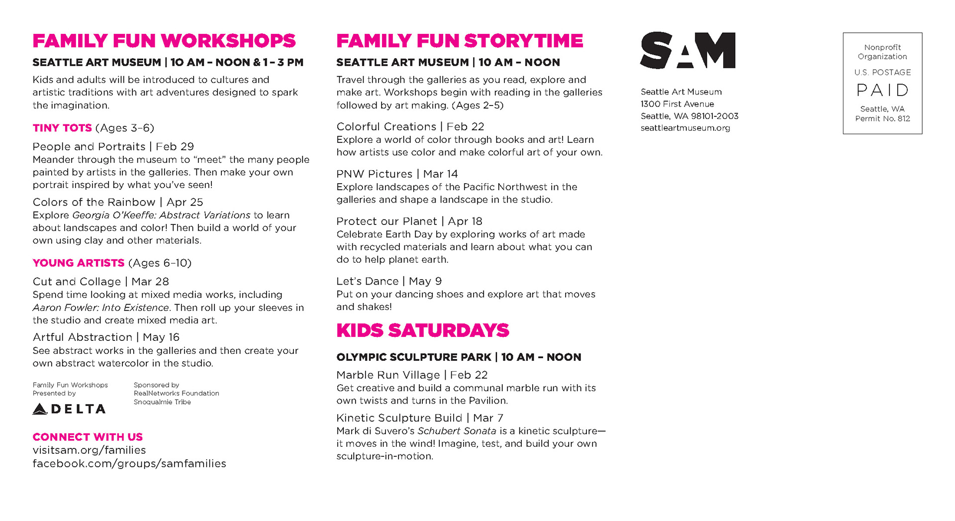
I designed a postcard for the education department's direct mail campaign promoting the SAM's spring kids and family programming.
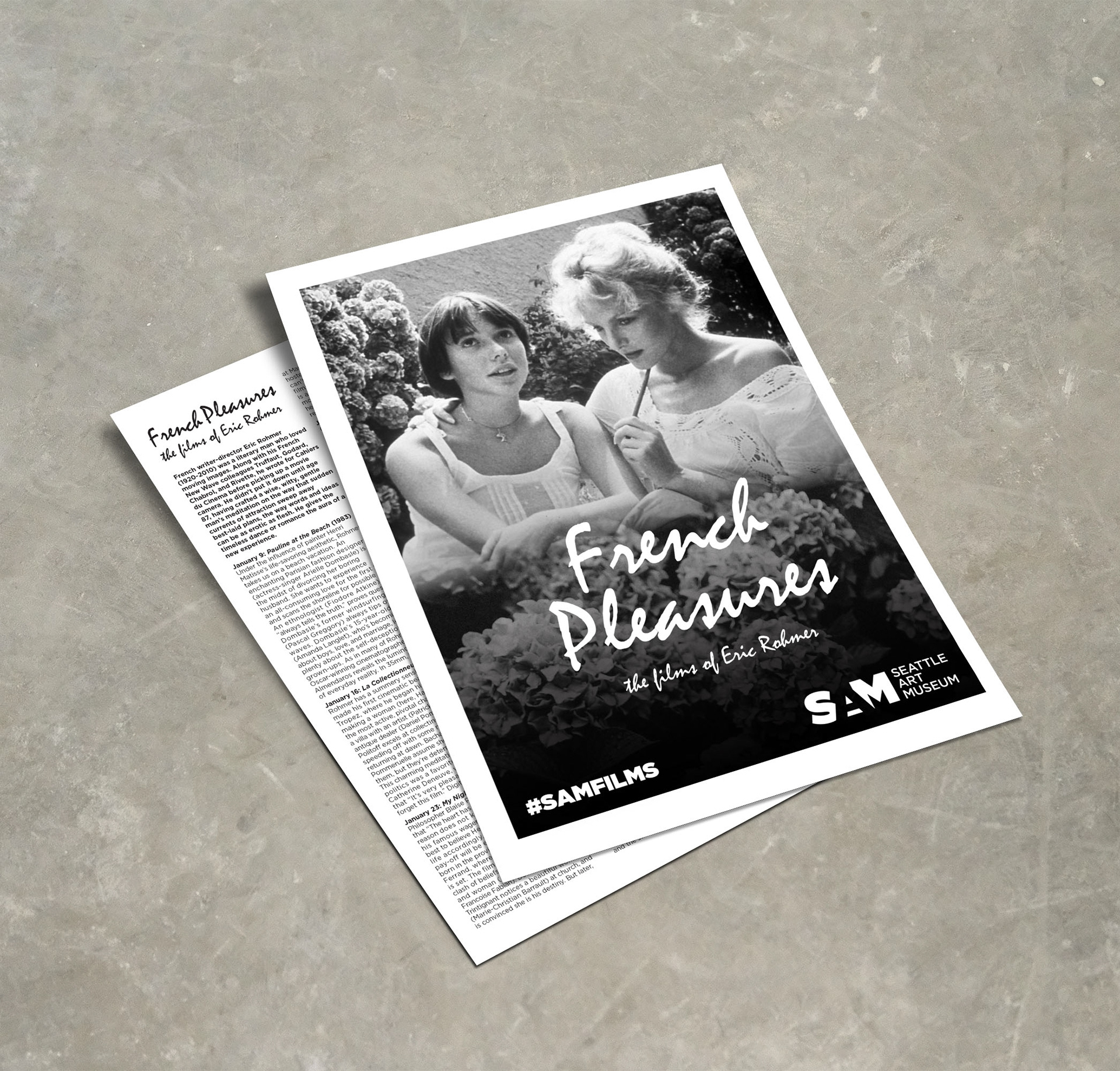
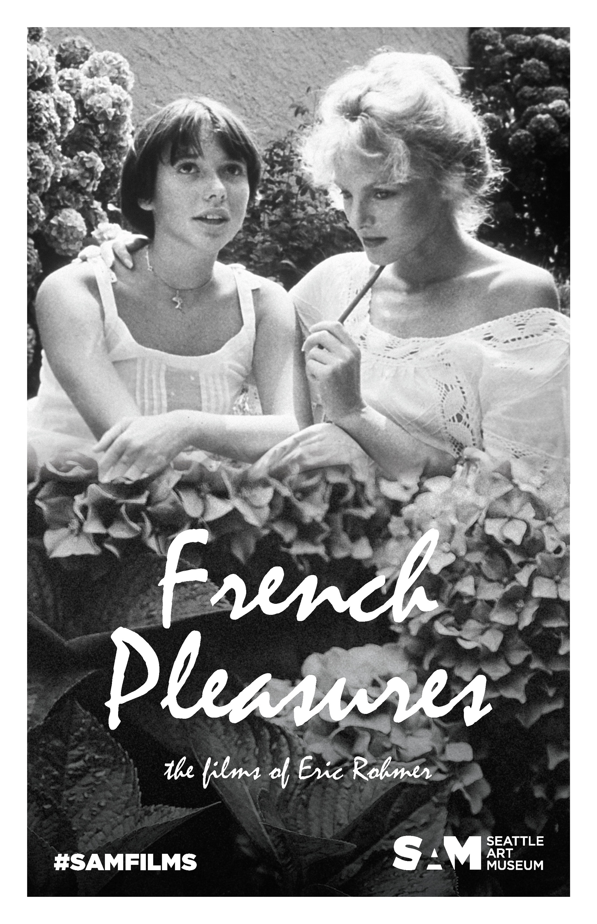
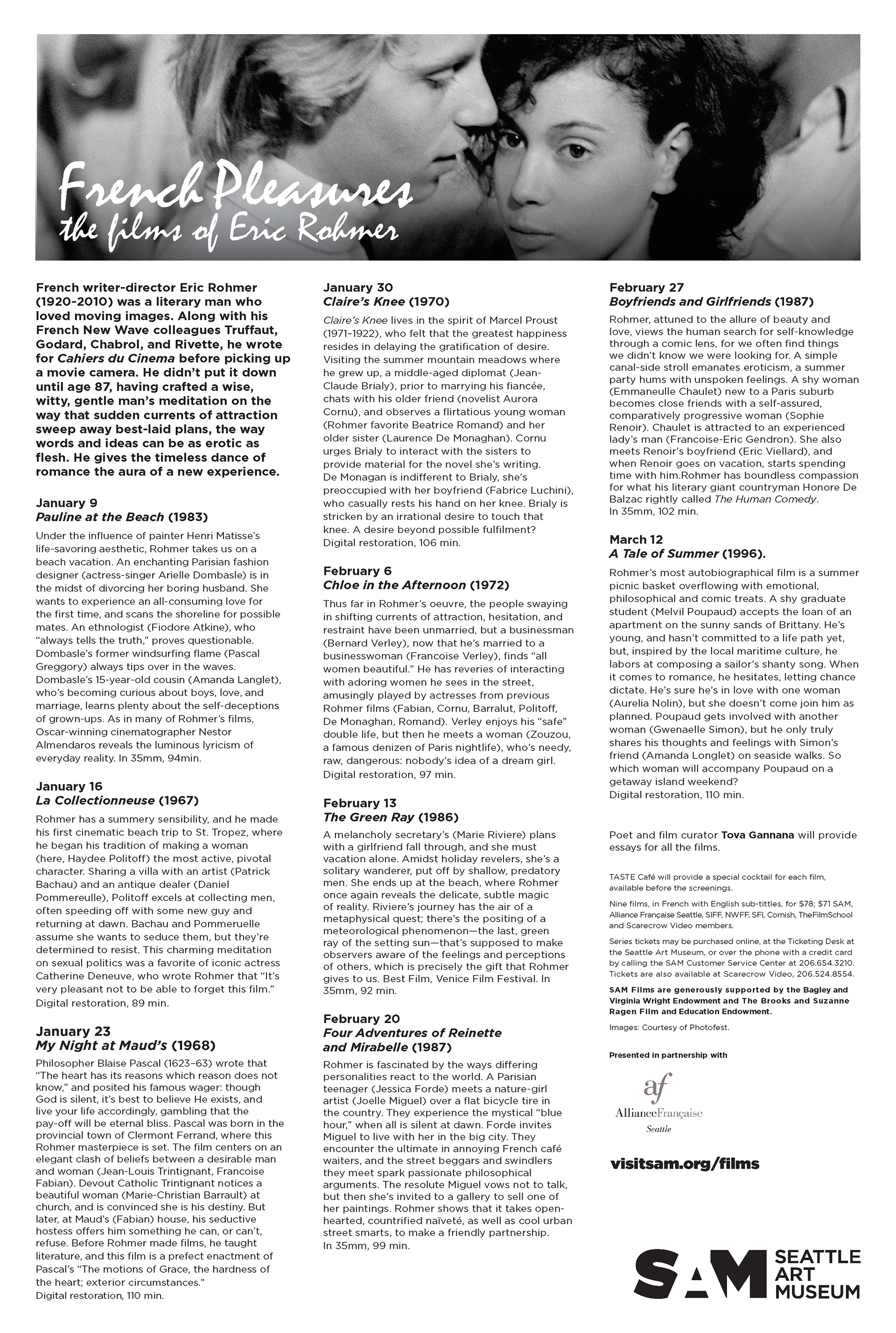
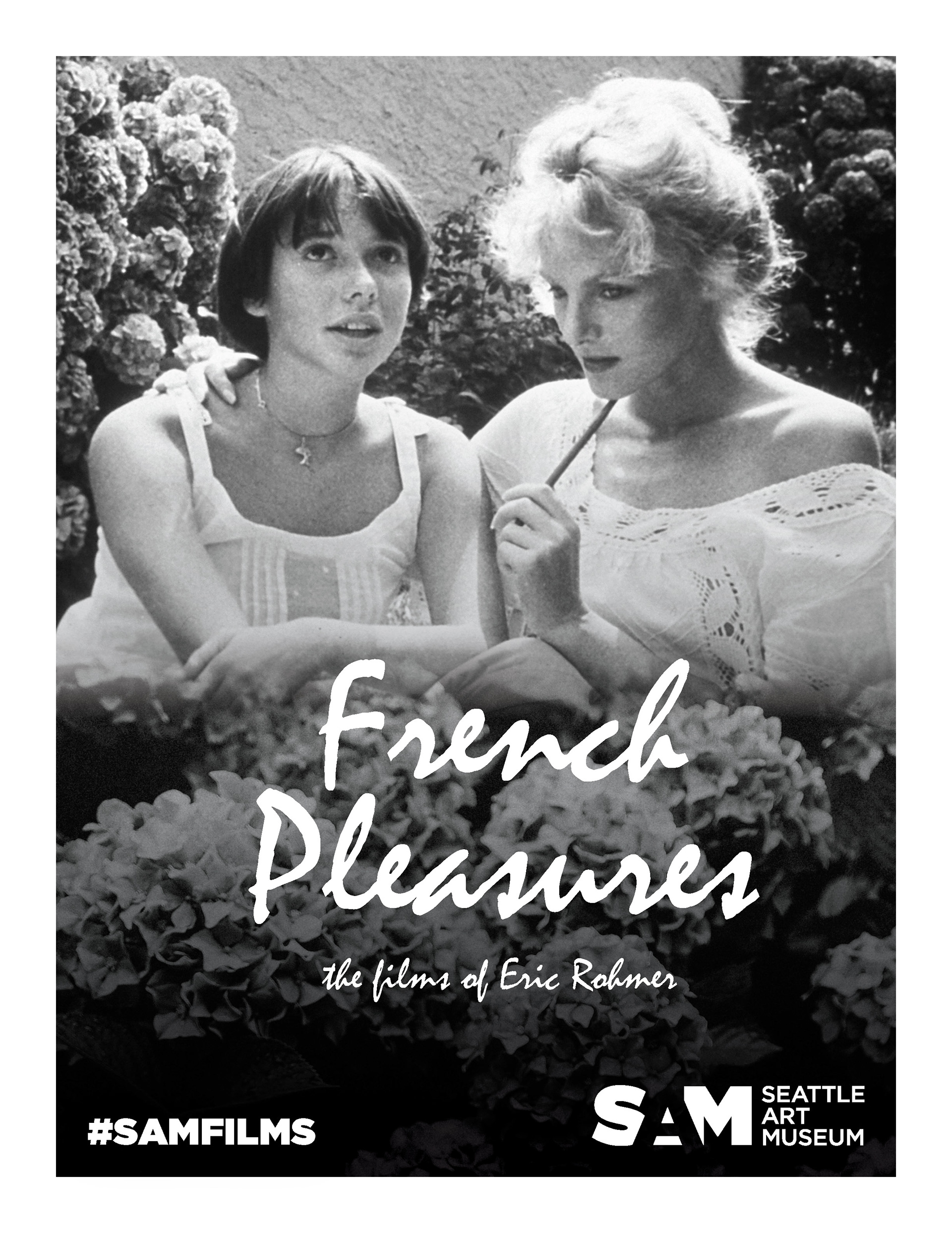
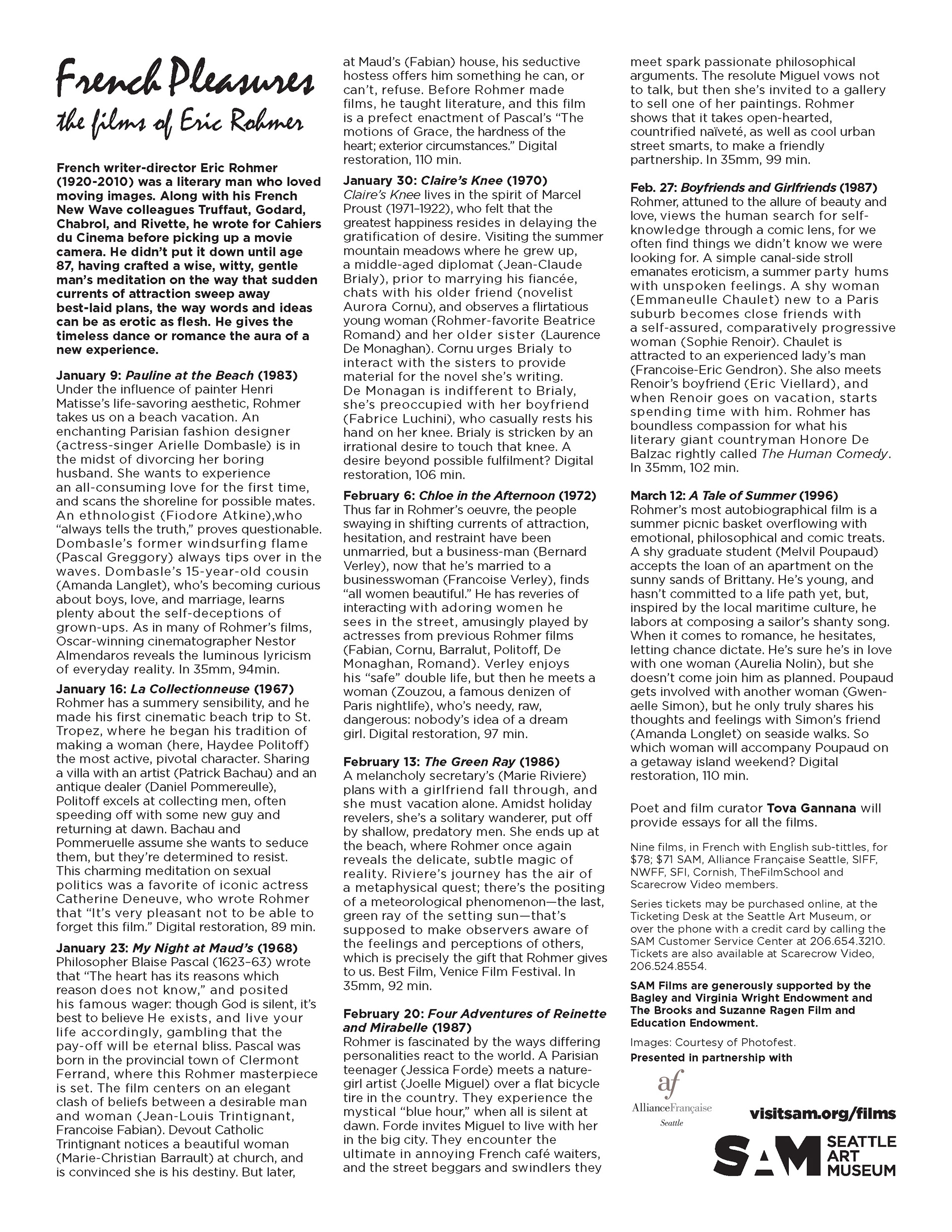
SAM's education department hosts several film series throughout the year. I created a poster/flyer in two sizes (letter and tabloid) for the French Pleasures: The Films Of Eric Rohmer series. I used a romantic typeface similar to French Nouveau movie posters for the title and manipulated the film still to work better vertically by overlapping and fading an image of hydrangeas overtop. The design needed to be in black and white and account for bleed, since it was printed in-house.The design needed to be in black and white and account for bleed, since it was printed in-house.
Flesh and Blood: Italian Masterpieces from the Capodimonte Museum was opening soon when I started my internship, so I got to work on the campaign and some in-gallery graphics per the exhibition's style guidelines. Above is the cover I designed for the large print gallery guide to improve visitor accessibility. I also worked on digital and print ads for The Stranger newspaper.
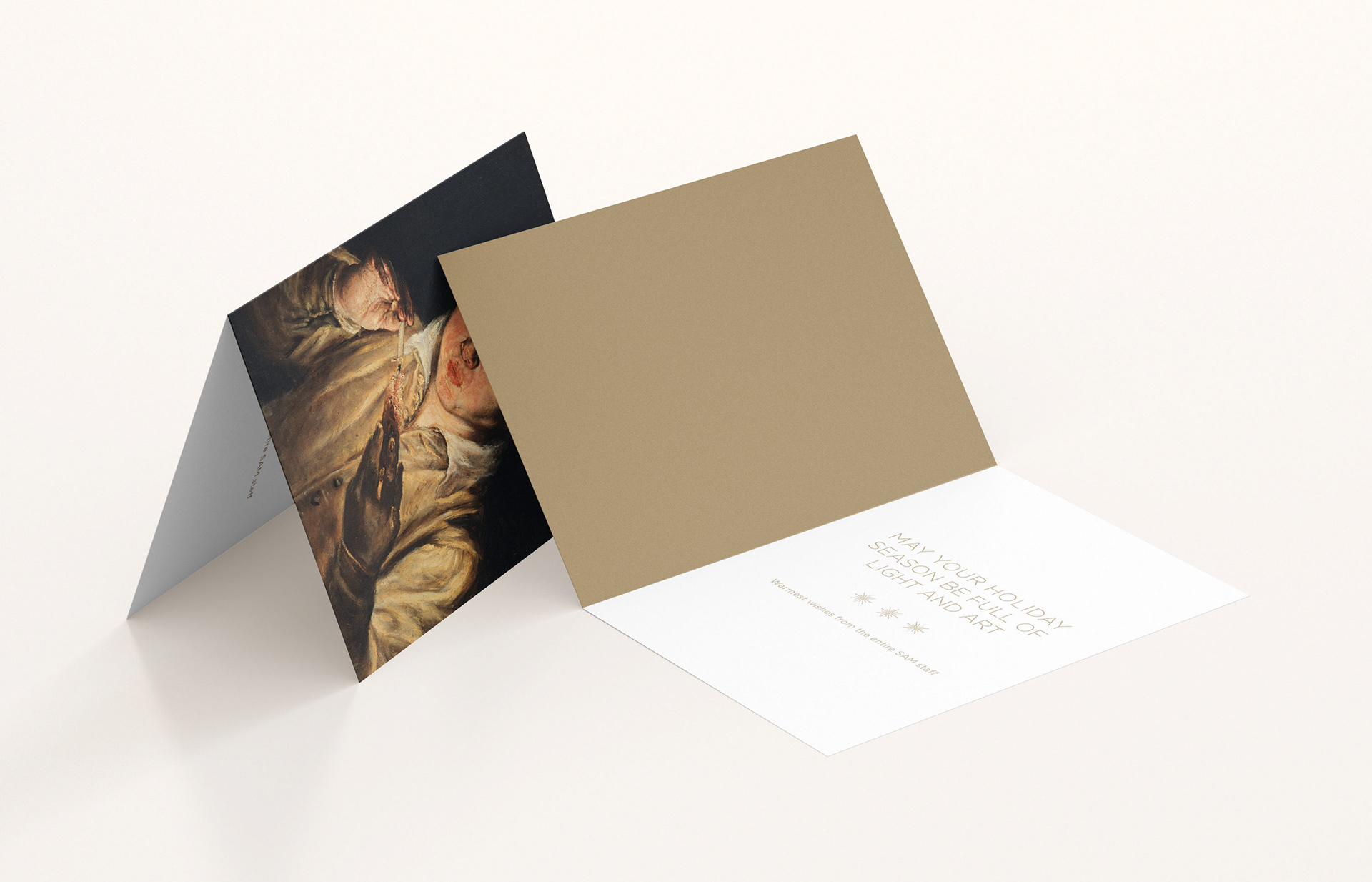
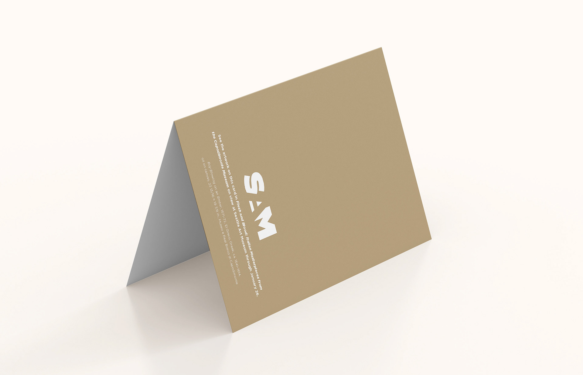
With the holidays around the corner, I designed a holiday card featuring a piece showing in Flesh & Blood for SAM's development department to send to essential stakeholders. The tan color featured in the card was a metallic spot color corresponding with other direct mail pieces for the exhibition.
