PERSONAL BRANDING
I wanted to represent myself in a minimalistic and professional way, that is still unique and demonstrates my personality. And while some aspects of my personal branding are still evolving, I wanted to share some of the latest designs here.
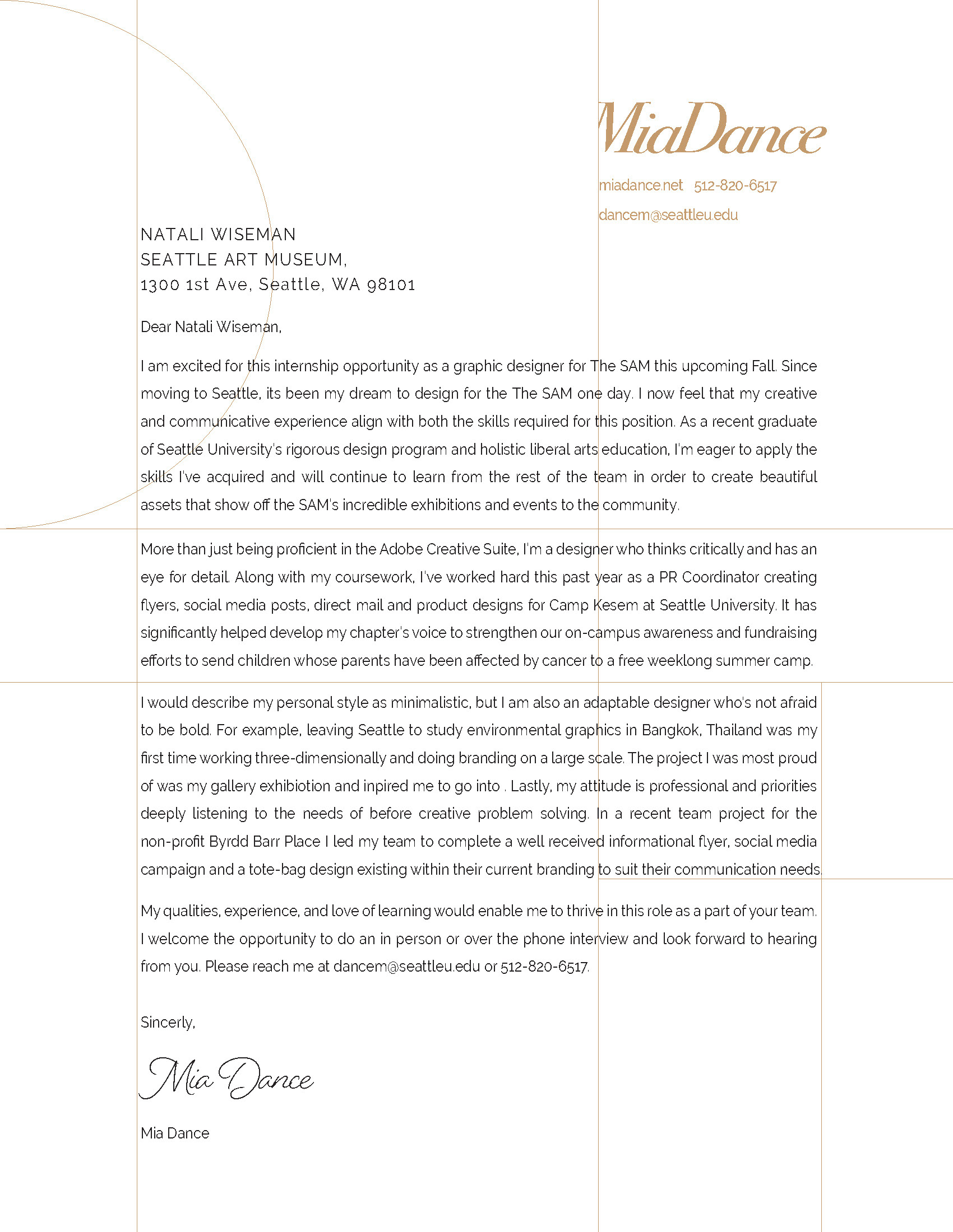
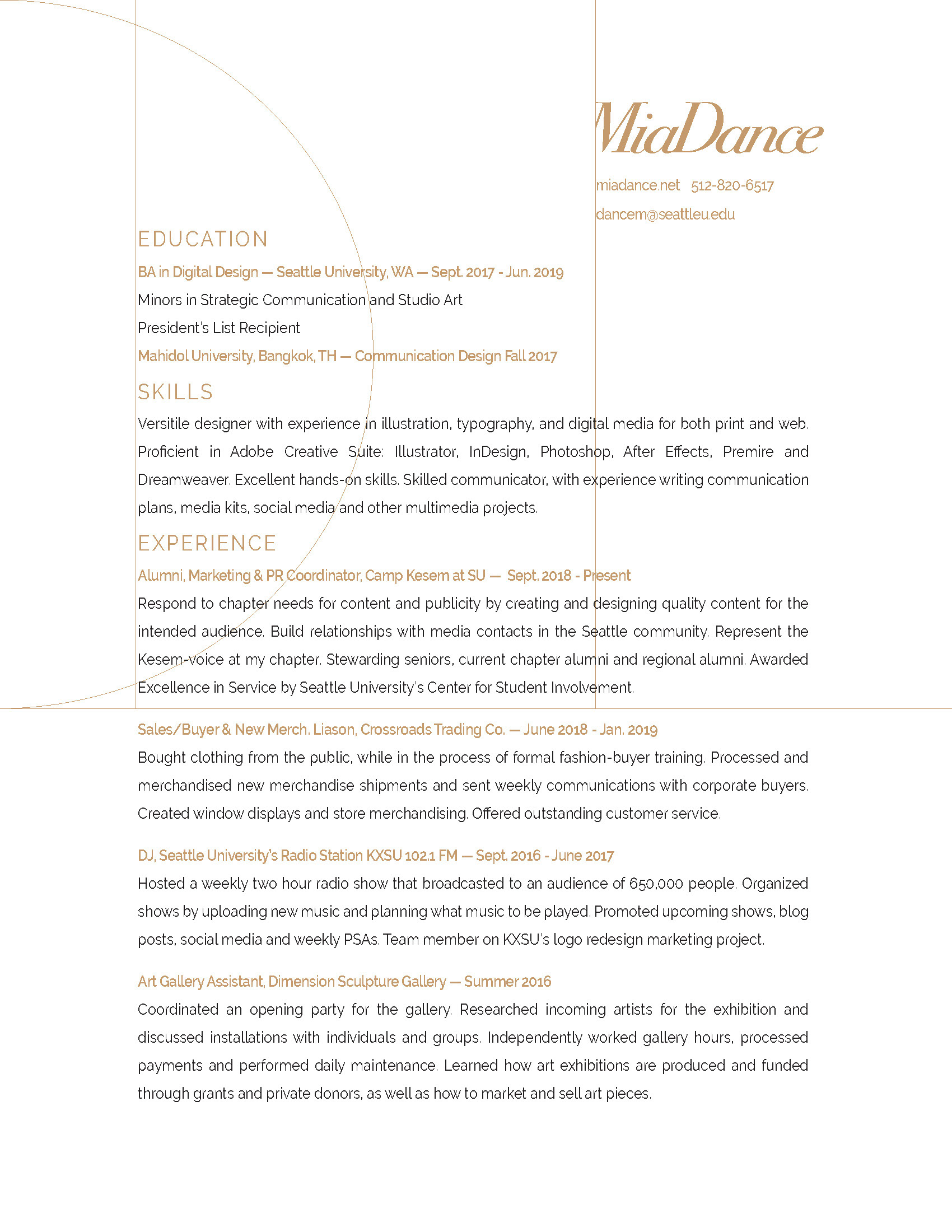
The word-mark for my name is in Bodoni Italics with tight kerning to play with the look and feel of a script typeface. When its applicable to the layout, such as in my resume and cover letter, I have chosen to crop the foot of the capital "M".
For my business card, I omitted my last name to create a striking design that defies the much smaller type sizes I often see. The back states my profession and includes important contact information. Bright white is contrasted with the organic texture of craft paper and can be seen in other self branded print materials.
Along with a resume and cover letter, I wanted to incorporate other items in my personal branding to help stand out from other applicants and demonstrate my capability to create a cohesive branded package.
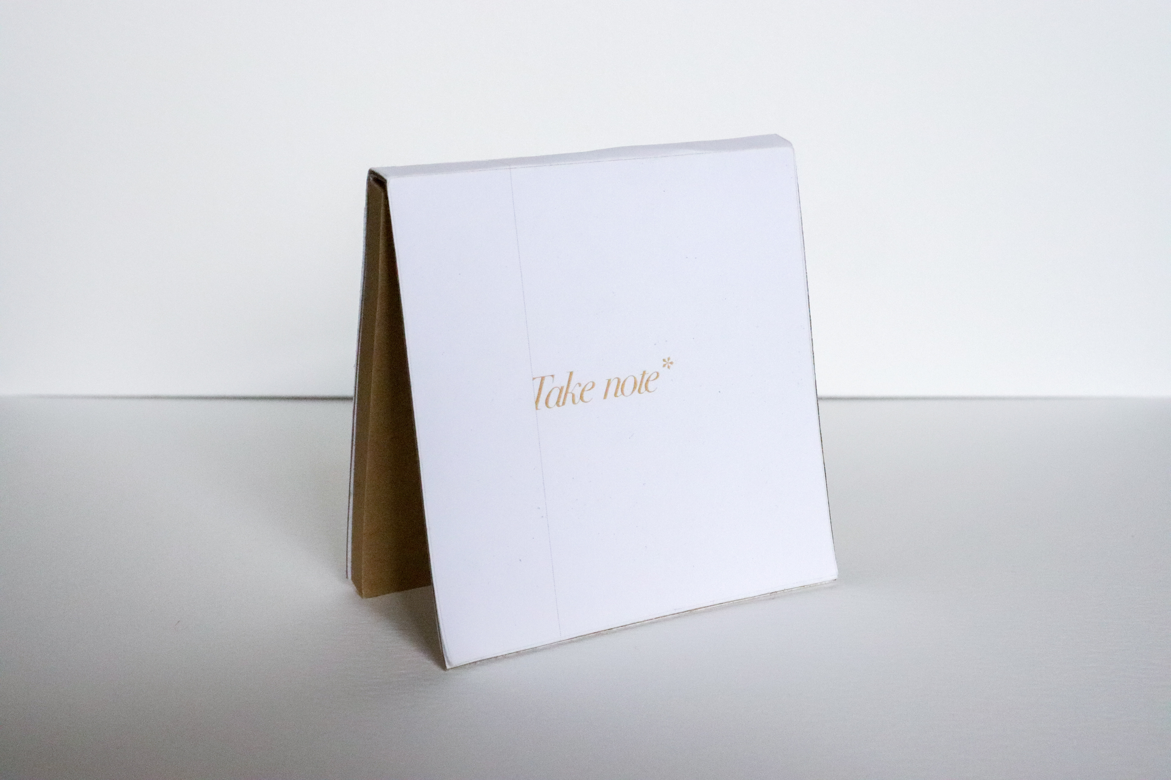
The back reads: *For when you're looking through applications and someone stands out.
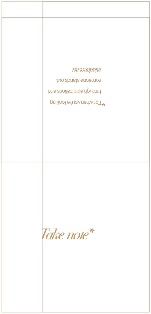
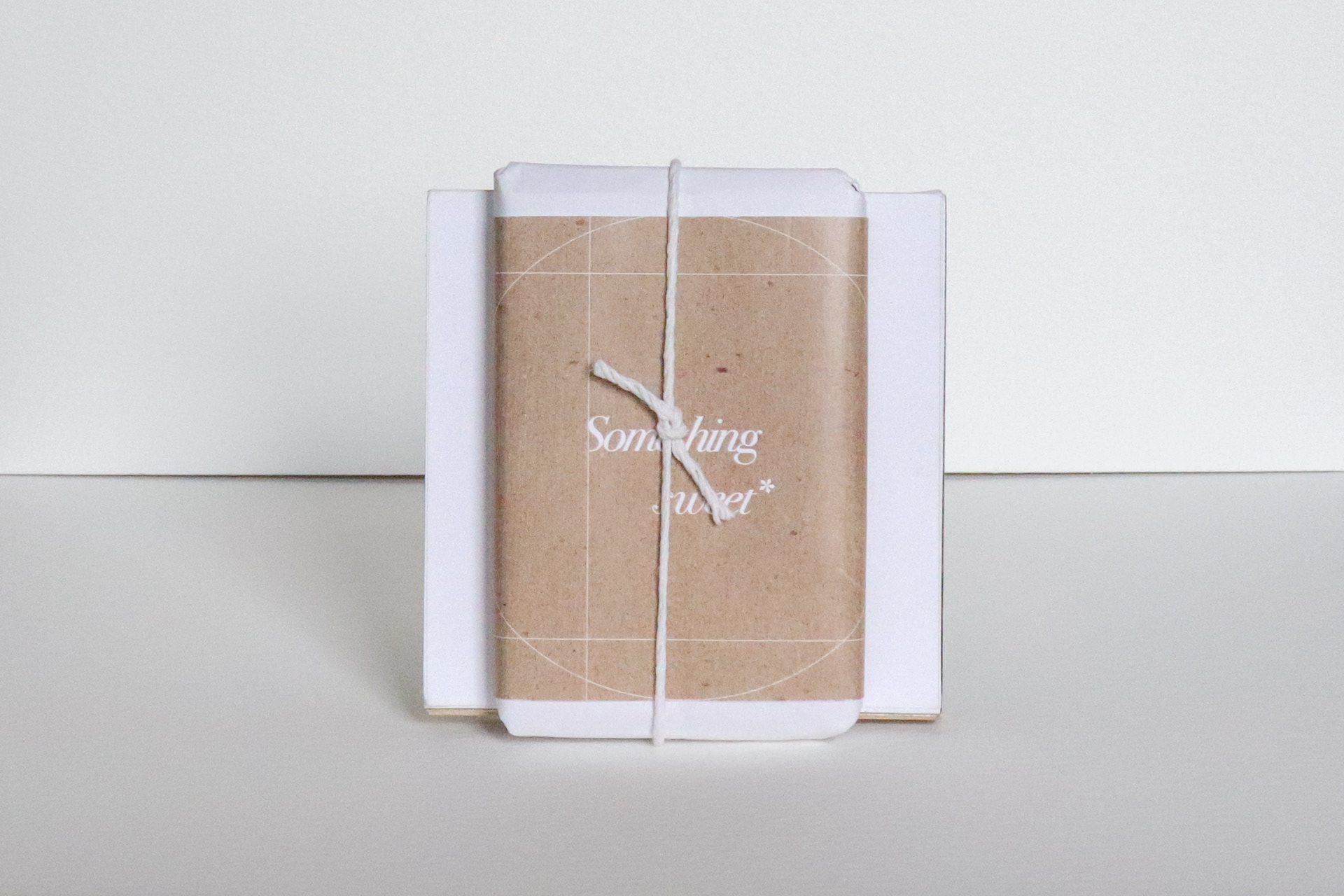
I decided to design a sticky note pad and a chocolate wrapper to serve as self promotional items and as gifts to thank my interviewers or those who will receive my application.
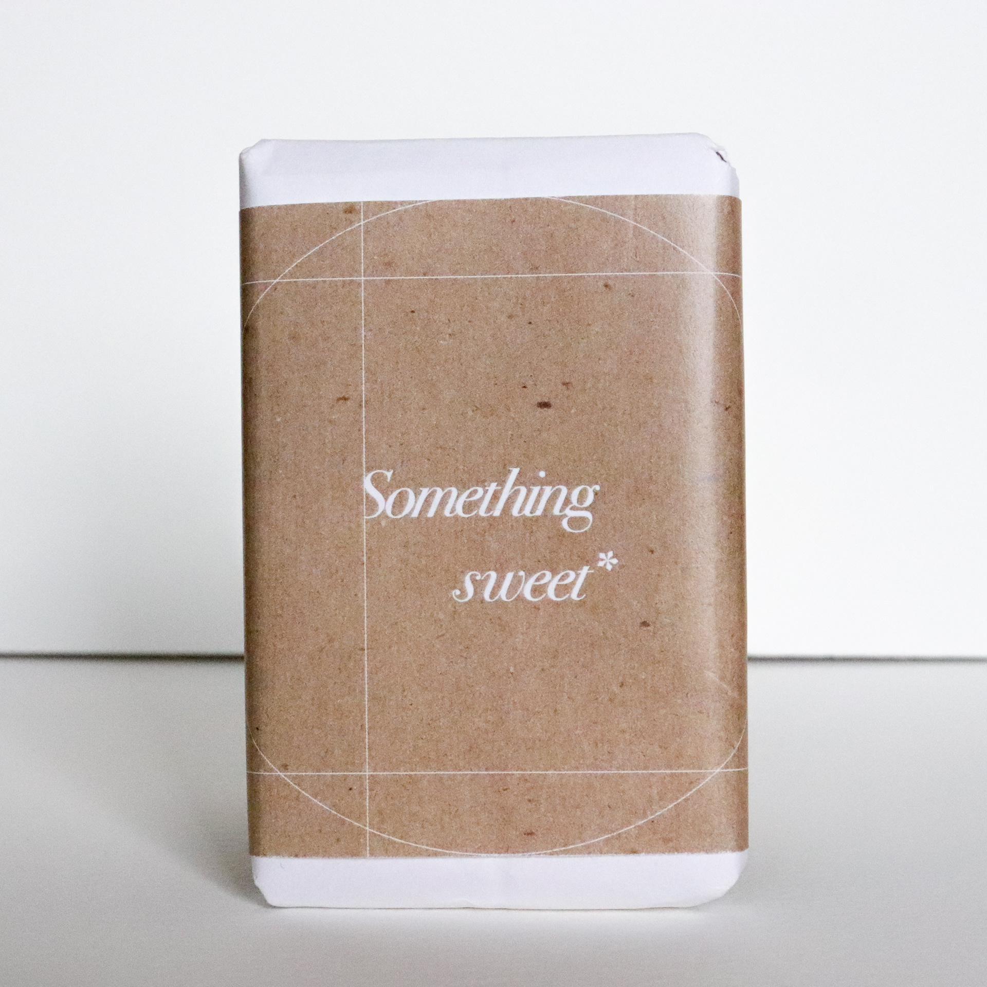
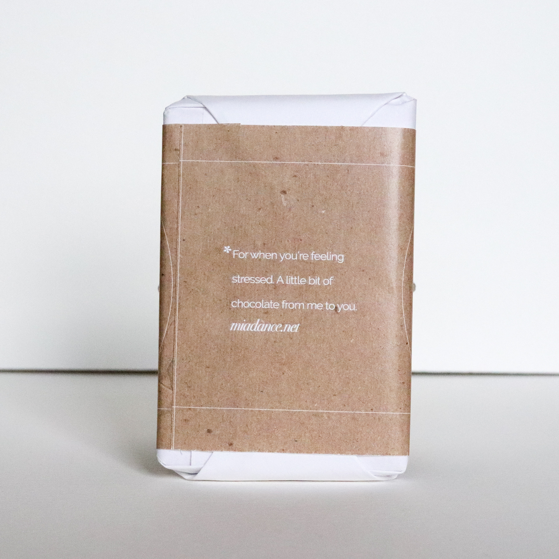
*For when you're feeling stressed. A little bit of chocolate from me to you.
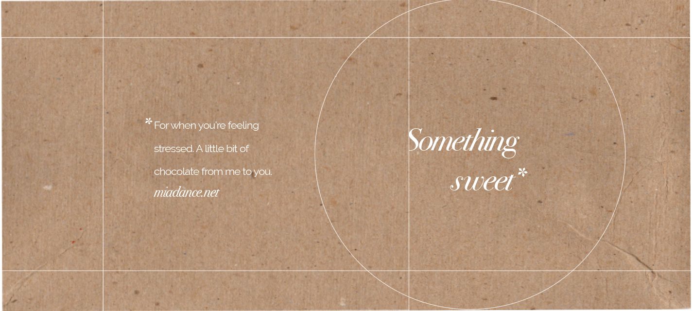
The phrases on the products are meant to demonstrate my sense of humor and thoughtfulness. It was important for me that both product designs would be purposeful and serve a function to those who receive it.
There is a very beautiful quality about a printed portfolio, so I made an 8x8 booklet featuring my undergraduate projects that I could bring along with me to interviews. I chose a minimalistic layout and carefully photographed my work. The booklet consists of 21 pages, uses a heavier weight paper for the font and back cover and is bound by a simple stitching technique.
